

Branding and Packaging
Richmond Lager Redesign

Who is Richmond Lager?
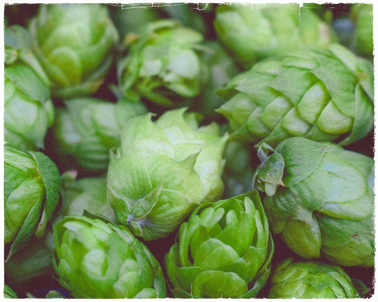
A somewhat newly established beer based in Richmond, Virginia, Richmond Lager has a crisp taste with light notes of citrus. Working under its parent company Hardywood, Richmond lager is brewed in the U.S. with Virginia grown hops. Much like the city that the lager gets its name from, Richmond lager values quality, craftsmanship, and artistry.
Moodboard
Before diving into drafting and designing, I needed to do some research about the current brand’s identity. I looked at their current logo, colors, products, and what they value and began building a mood-board to inspire the brand’s re-imagined identity.
A New Mark
When re-designing the logo, I took inspiration from Richmond’s community of artists and creators. I used and slightly modified a typeface which is reminiscent of old movie posters and hand-painted signs, which you can find all over the city of Richmond. I also decided to update the colors, picking deeper tones to make the design feel more welcoming and mature. I made three variations of the logo to work in different situations; a lettermark, wordmark, and combination mark.


Packaging
I wanted the packaging to look refreshing but also a bit aged (like fine wine). Using the red as a primary color catches the customer’s eye and adding the familiarity of the cardboard box, welcomes them to pick it up.


